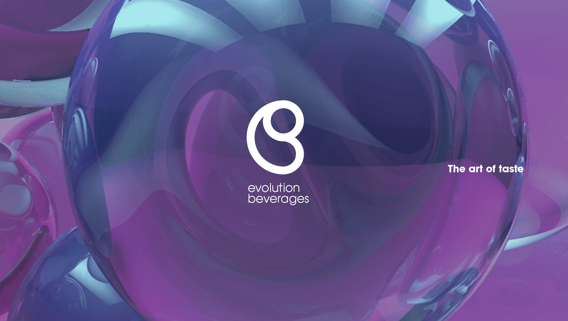
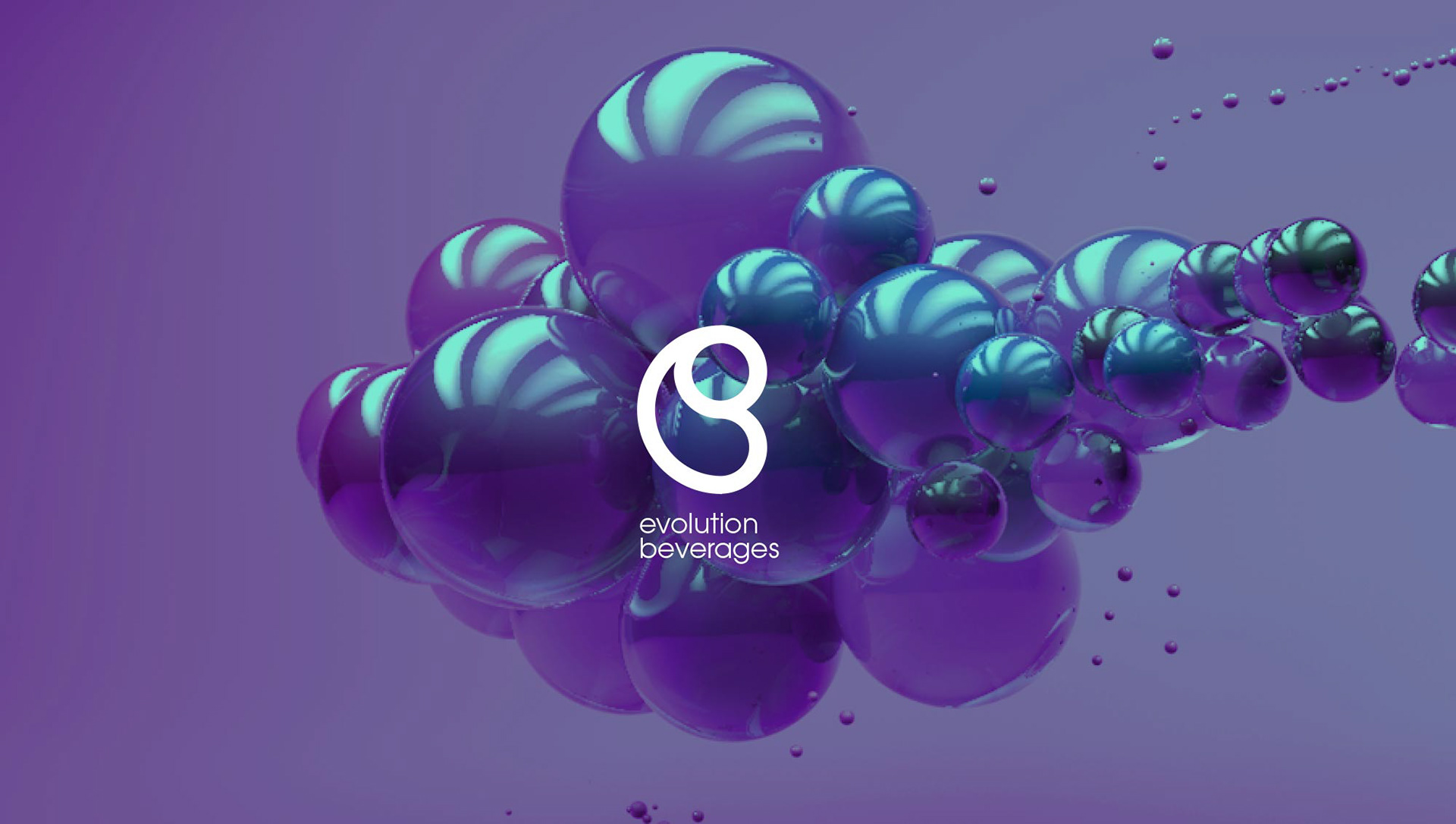

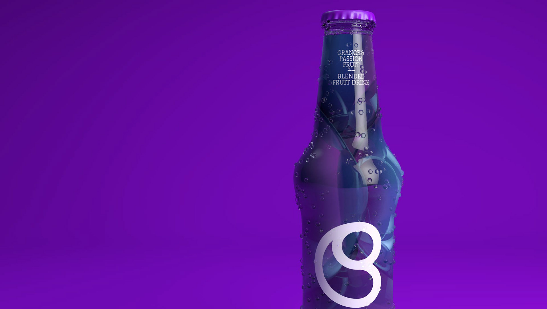
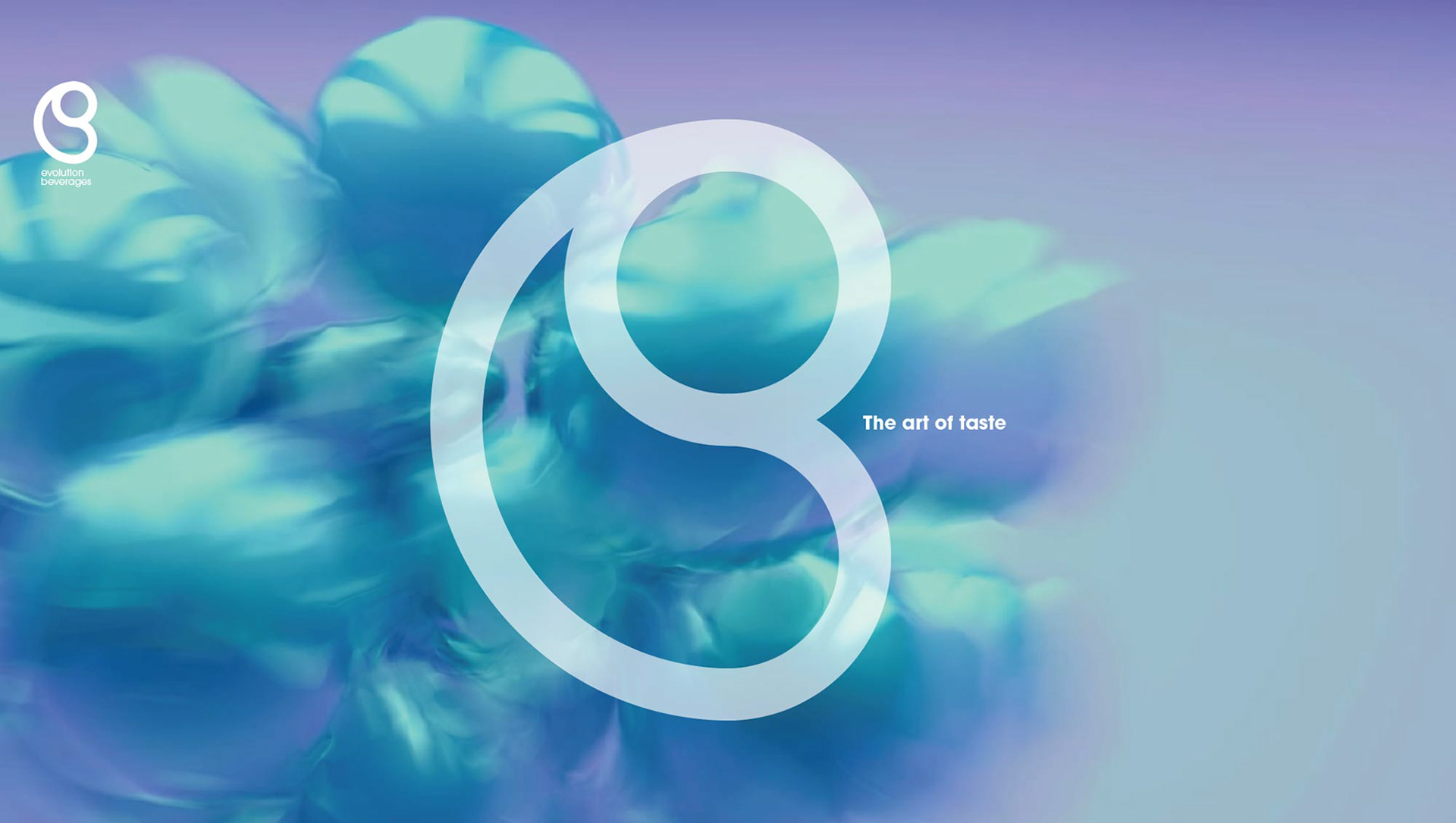
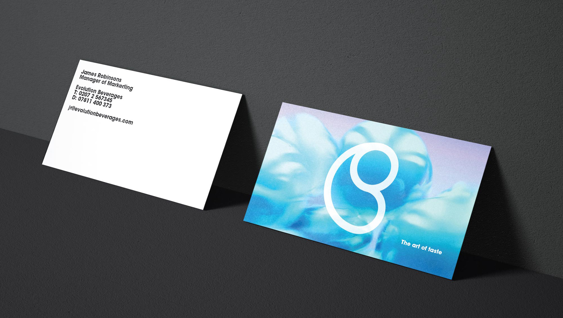
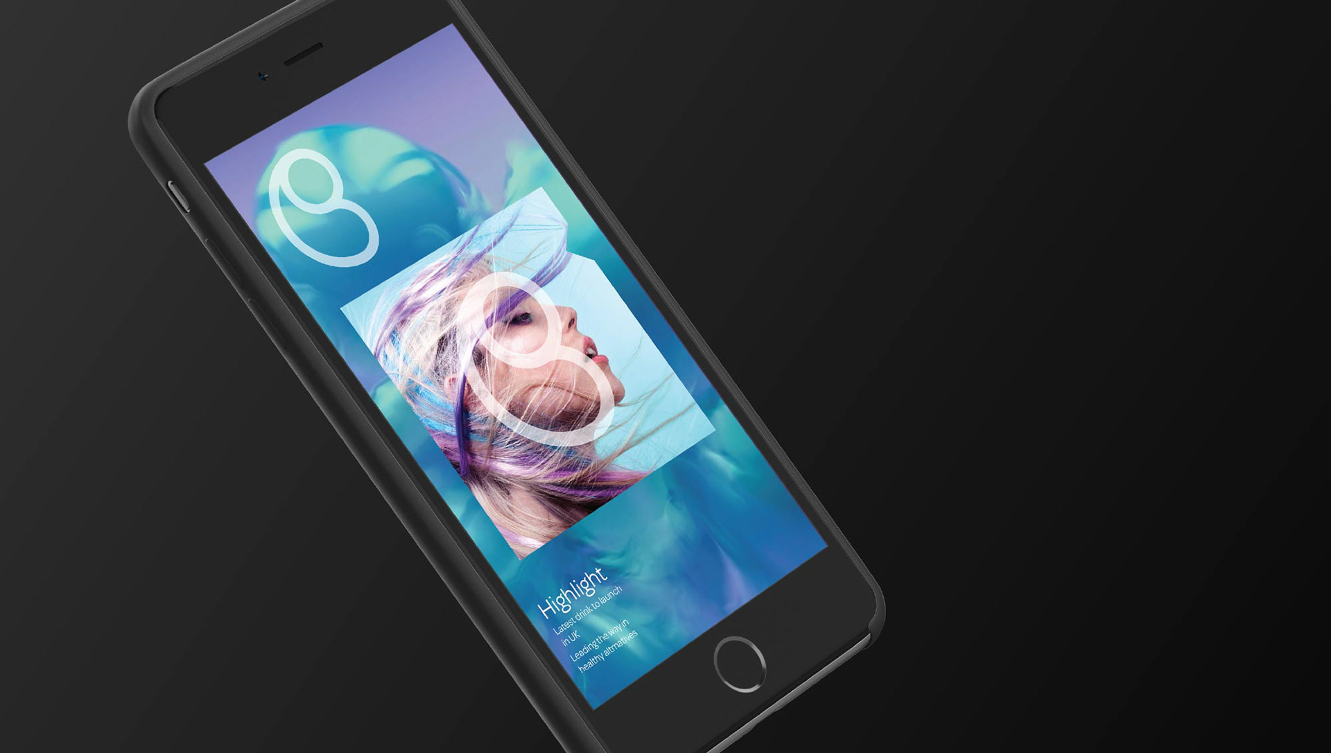
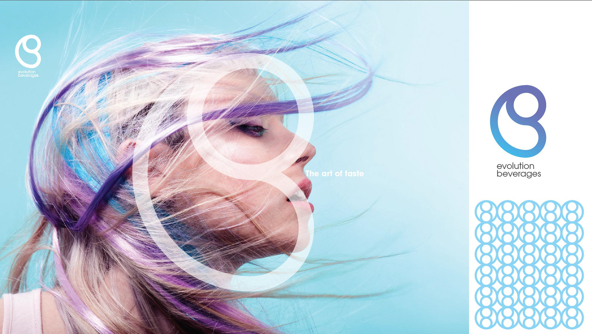
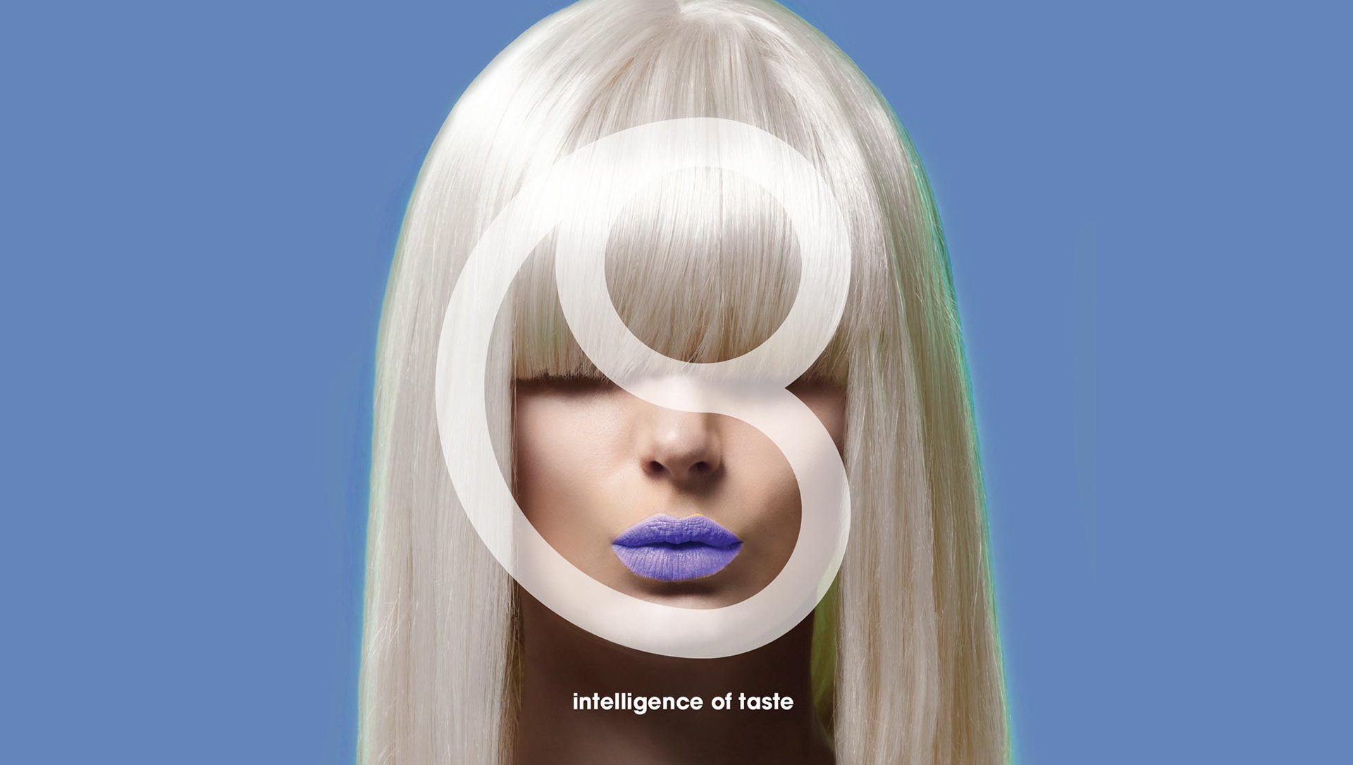
This is a concept for a drinks company called Evolution Beverages. The brand is based on the symmetry of the circle, a large circle and 2 smaller circles placed inside. These circles are representative of the gas infused into drinks, while at the same time the mark is a combination of both the letter 'e' and 'B'. The packaging is fictitious as they wont be creating drinks called Evolution Beverages, but a nice way to express the logo. Additionally, the two parts of the mark express the mind and the mouth, two core aspects to taste, I also used the mark to define the intelligence to the company and the artistry to the company, using the mark to connect these concepts.
I enjoyed this project as it combined the 3 things I enjoy, branding foremost, but also packaging and animation.